Richard Emberton UX Design
User Experience and Product Designer
Re-designing security for Microsoft
Making an admin tool easier for new users
Microsoft's Forefront Identity Manager was being updated, and an opportunity opened up to address usability concerns.
- Quicker, easier access to nested feature sets was a stated goal; initial suggestions included maybe using imagery or "sign posts."
- Feature names might change with product update.
- Some areas may need explanation text surfaced, as name-title doesn't necessary explain their function.
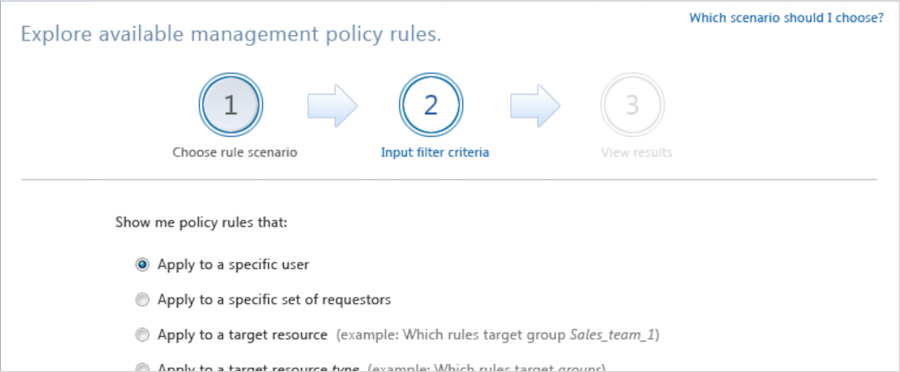
High-fidelity prototype in HTML.
Role and scope
One designer, often reaching out to other UX teams at Microsoft, to utilize existing related research.
The project was largely information architecture and UI design.
With much of their known UX issues being from informal customer feedback collected when dev team leads talked with customers at trade shows, etc.
Research
Feedback was collected through user interviews, contextual inquiry, and from:
- Known issues discussed in past PM meetings with customers.
- Help Center's issue tracking.
- Observing the Post-it notes that users collect around their monitors, and the cheat-sheets users had prepared for themselves, and to help on-boarding their new team members.
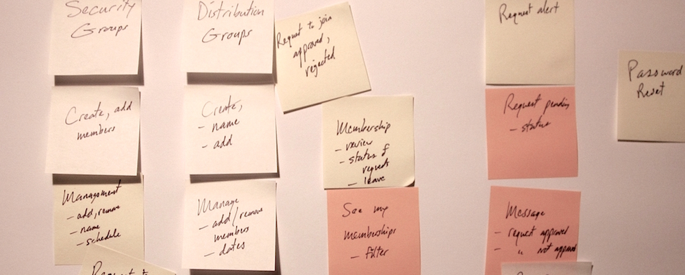
A Post-it notes wall card sorting exercise to re-group links into categories and sub-categories.
Additional details were revealing through cognitive walkthroughs and simple heuristic evaluations.
Discussion with product stakeholders factored in the business goals and aided in prioritization.
And sync'ing with dev's schedule allowed UX issues to be addressed before dev worked on that part of the code.
Ideation and Design
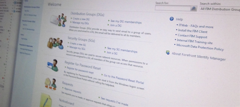
Simple broad categories were proposed for the beginning of user's experience,
with labels and descriptions of sub-categories or items surfaced immediately below,
as a rapid means to find and jump to key areas in the product.
The duplicates issue:
The need to access the same thing from different areas, in the prior tree navigation, was a known issue.
Other issues:
- Tree-climbing (expand/collapse/scroll) in the prior tree navigation was awkward.
- Logical groupings vs. frequent/rare accessed items... Maybe add a frequent or recent items list...
- One UX for both newbie and expert...
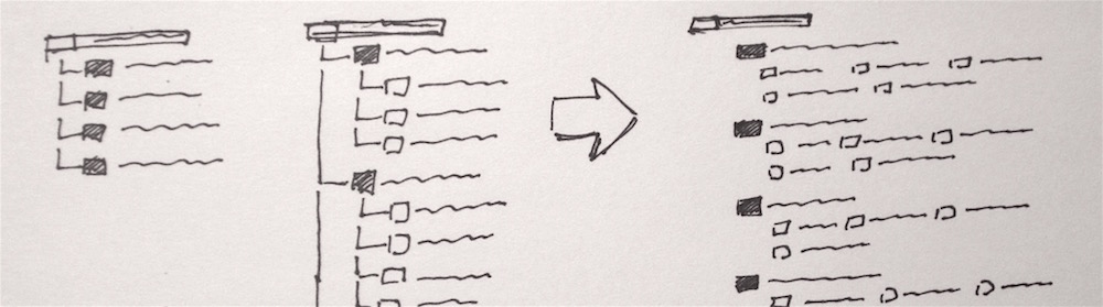
Sketch comparing tree nav with a contents page arrangement (grouped headings and sub-item links) to reduce vertical scrolling and allow more items to be visible without opening tree "branches."
Quick slide-show prototypes of existing product screens, but altered, were used for rapid informal tests of variations.
Demo presentations were used to help "sell" ideas and get buy-in.
And discussions with the business-side stakeholders revealed which features they wanted to showcase for competitive reasons.
The dev team's enthusiasm for UX changes made all the difference.
Storyboards were placed on a wall where the dev team would frequently walk by, to help keep busy developers in the loop regarding design, and invite their involvement.
Design decisions
Factors that shaped the design direction included:
- The sense of grasping, of being oriented and more easily able to navigate up and down through content categories.
- Treating the navigation more like content, rather then as a side navigation control (as in the prior tree navigation).
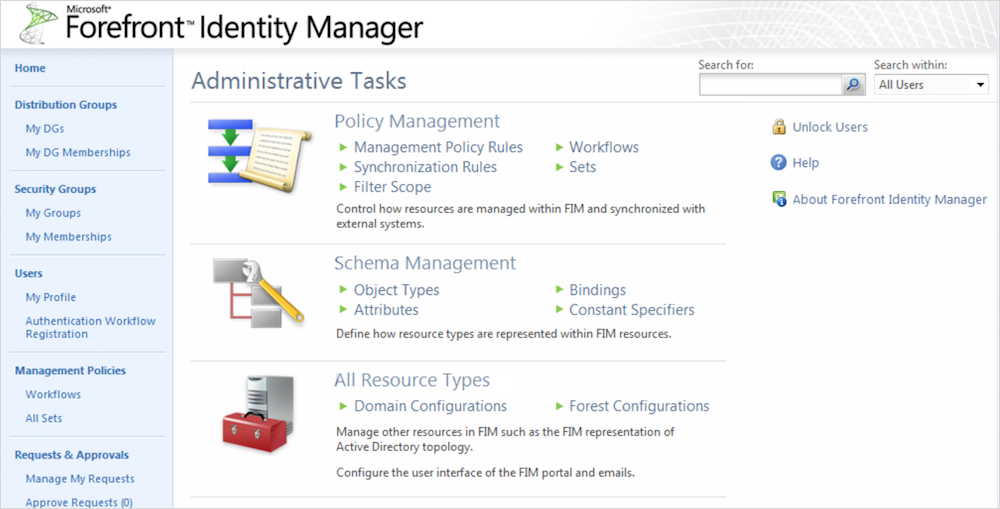
High-fidelity screens were prepared for prototyping, after wireframe prototypes.
Prototype and Test
Paper prototypes were used for visual grouping of items in various screen layouts.
Slideshow storyboards with click-able areas were prepared for scenario walk thru simulation.
The right story was carefully prepared to set up the scenario and the mindset of the test subject.
And additional hi-fi click-thru screens for key scenarios were presented later, with dev cheering on, to help get stakeholder final agreement.
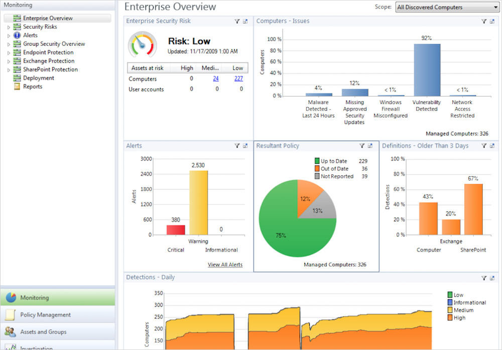
High-fidelity prototype screen for a sequential process.
Final Results, lessons learned...
When dev sees that their hard work will be more easily received by users, they see the value in UX design.
Dev and UX then both move forward with mutual support.
Dev enthusiasm and volunteering... particular developers would sometimes run with an initial UX suggestion and show me what they could build even before it was designed.
One example: When content in a form changes based on user choices, animating a fade and slide rather than a jarring sudden replace.
Positive word spread, and I was ask to clean up the UI for related console app.
And a few more details:
- Showing the right amount of "help" in the immediate UI.
- Balancing the user's cognitive load, and be aware of their confidence in their mental abilities...
- Make exploring easy and cost free for the user, with easy bail out and fall back.
- Allow the repeat of exploration, for learning the landscape...
Next project →