Richard Emberton UX Design
User Experience and Product Designer
A favorites list for Zillow
Designing a new Favorites tool
Favorites would let each user collect their own unique list of properties to watch.
The design would needed to integrate into Zillow's existing design language.
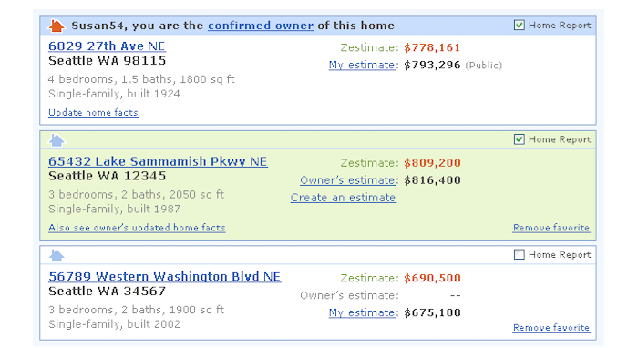
High-fidelity prototypse were prepared showing various arrangements for the details in list items.
Role and scope
One designer focused on creating a design from scratch, within a team of 5+ designers/researchers at that time.
The task was to balance a serious design effort with management's aggressive time constraint to make it available ASAP, so design fast.
The Problem
Determine what users want/need/expect, and "sell it" so management won't go forward with too bare-bones of a feature.
But also understand the stakeholder's urgency to be competitive in the market.
So, make the smart trade-offs for both the business's success and for the user.
Research
Research included reviewing what currently existed, for user expectations:
- The competition, what they already had available may have set user expectations.
- User requests for some way to flag or collect particular listed properties.
- Review existing standards for similar lists: Adding/removing, filtering, page vs. scroll...
- Customization, not just saving your list but how your list displays.
- Reviewing existing eye-tracking info for how users scan lists and the details in list items.
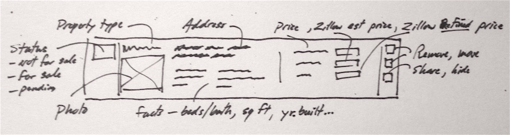
Wireframe sketch to capture the possible details in a list item.
Ads would also display above, beside, and even in the middle of the content.
And even among items in the user's favorites list.
UX could sometimes negotiate ad placement, but the ads are the money maker... so they would be factored into the design
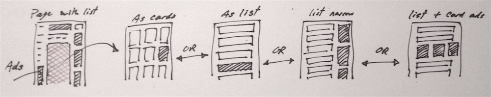
Sketch showing ad placement above, beside and within the list.
Design phase
Basics for the design of the Favorites focused on user key tasks:
- How to flag a property as a favorite.
- How to review your favorites (how to view, or navigate to, the list.)
- How to edit your favorites list.
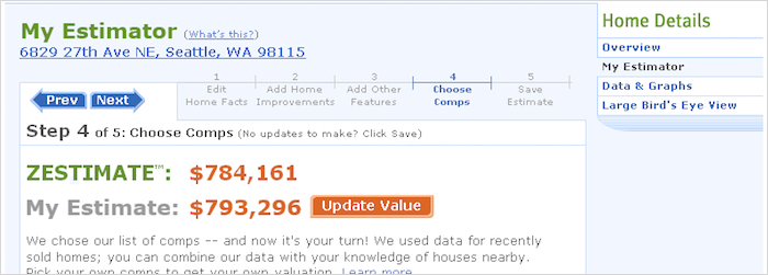
- How to modify an item in your list using Zillow estimator tool.
Status indicators on items were needed to show a property's value change, sale pending, etc.
Multiple wireframes and higher fidelity mock-up were generated for quick informal tests and refinement throughout the design phase.
Wireframes were used to get a more realist sense of how the content would display in the given area.
Additional design details that needed to be considered:
- How to comparing the user's owned properties to others.
- Editing controls, response time, undo...
- Ordering the list, ordering the info displayed in a item.
- Comparing item details.
- Easily find something in a long list.
- And how the list would display on different screen sizes.
...the pressure to just get something out fast, because the competition is already there.
Design decisions
Reviews were conducted with subject matter experts within Zillow,
for what information users may want to see even if they don't know to ask for it.
Technical constraints were verified to avoid designing what dev simply couldn't do.
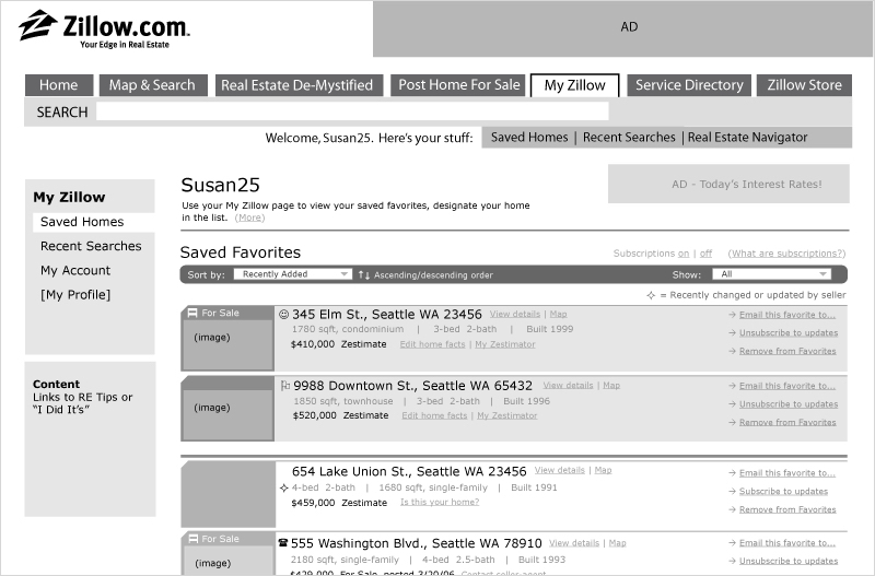
A High-fidelity screen as the UI became more finalized.
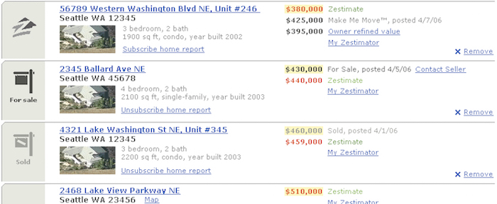
The design converged toward a basic list, with emphasis on the order of details within list items.
Prototype and test
Lo-fidelity paper prototypes were used for quick tests of interaction with list variations.
Slideshows of hi-fi screens were used to help get management buy-in and go-ahead.
And to show how the feature would integrate into the rest of Zillow's site.
Dev began before the design interaction or UI details were finalized.
Careful negotiation was sometimes required to get the final UX in place.
Hi-fi prototypes for the list item links used Zillow's existing visual language.
Final results, what was learned
The feature would go on to be successful but the initial release was very bare-bones.
Some key take-aways:
- Management can decide to forgo the schedule and "go with what we have" due to pressure from the market.
- Rationale based on research may not always be enough.
You may need to appeal to business-side reasoning.
- Be ready for trade-offs when things are moving fast...
- Dev bugs can cause UX to get cut.
- Always talk toward a win-win, and always present UX as an advantage, not an obligation.
- And sometimes start by asking for more, it's easier to negotiate down than up.
← Back to first project
Home page