Richard Emberton UX Design
User Experience and Product Designer
Guidelines for a suite of diverse apps
Bringing a family of acquired products together
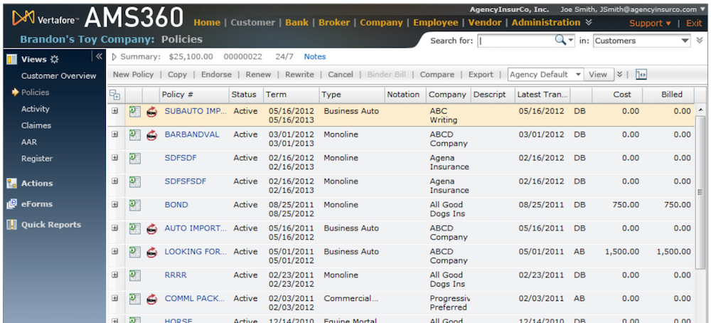
Vertafore had built up a collection of apps for the insurance industry, some acquired, some developed in-house, and needed to unify the different user experiences, for coordinated suites.
The user experiences across the product range was tremendously varied, with some having older style UI, and others simply being engineer-built.
And years of patches and fixes were also apparent in the UX.
Guidelines site prototype main menu.
Problem/Solution
Several key obstacles existed:
- Would existing users, who had become familiar with their unique apps, find the standardization too jarring?
- And would stakeholders choose to leave some parts of the older inconsistent UX in place,
to avoid upsetting customers, and/or to avoid development costs?
A guidelines document was proposed, with areas initially targeted:
- Navigation consistency, and information architecture
- Common tasks like Search and list display, filtering and sorting
- Menus, system messages, labeling and wording
- Long forms and step-processes
- Coordination with a new brand direction being developed by an external agency
- UI and visual design: Fonts, links, buttons, icons...
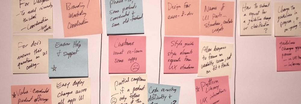
Card sort exercise with a Post-it notes wall: Goals, needs, priorities and pain points for the guidelines document.
Role and Scope
The Designer's Role: One designer in charge of the entire guidelines effort,
to get across-the-company guidelines up-and-running, own/control it, and get buy-in from all the key players.
All while being part of a team of 6 or 7 designers and researchers, who were each using their own unique ad hoc guidelines for the various apps they supported.
The unified guidelines would be successful if they:
- Drive fixes for priority consistency issues
- Fill the void of no current real guidelines
- Accepted by dev teams
- Easily updated, a "living, breathing" document
And v1 was needed ASAP (separate style guide and pattern libraries could be spun off later.)
Stakeholders also indicated certain areas were not in scope.
Some particular features would be left as-is, or have visual fixes only.
Dev was obligation to not touch certain areas of legacy code that management didn't want to risk breaking.
Research and personas
Existing research was leveraged from particular products, and their designs, as the basis for the cross-product guideline.
That general design was then trimmed down to just the basics, with parameters to allow some flexibility.
The research did indicate that users who'd learned an existing and even awkward product didn't want to re-learn something they already knew how to do.
So we'd also need to present the "upgrade" as a usage advantage, not a style change.
Users knew their unique UX and might not want it to change.
Existing personas were borrowed from individual product teams,
and used to prepare proto-personas for the different proposed suites.
On a strategic level, these consolidated personas helped reveal which products should be grouped into which suite offerings.
Personas were also prepared for the guidelines document itself, for the developers and designers who'd use it.
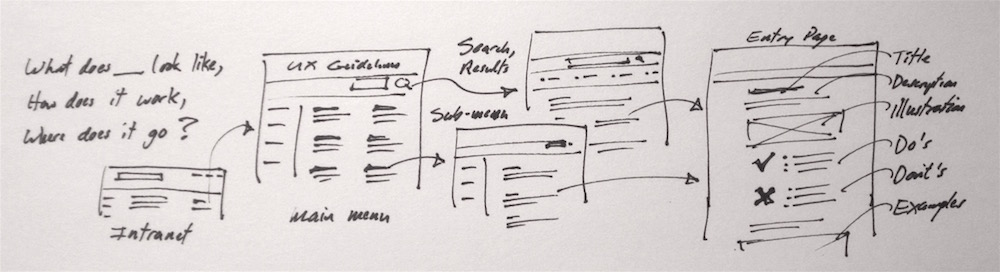
Sketch to capture the basic task flow: A developer has a UI question, uses Search or a Contents page, and jumps to an individual entry.
Ideation and design
For designing the guidelines site itself, a first step was to determine what dev and UX team members want it to do...
Card sorting exercises helped bring priorities to the top.
- Easy and fast to find what you're looking for
- Easy-to-read and understand individual entries
- Simple nav; and maybe a visual contents page for quick recognize-and-go.
And don't rely on names of UX widgets, as those weren't consistent across dev or design.
The site should also be easy to maintain and debug, using simple HTML.
An initial sketch to find a more logical nesting order for various navigation mechanisms across the products.
For editing, adding and updating entries in the guidelines, a simple review/approve process would be in effect at the start.
Initially approvals for changes would be done case-by-case,
with the plan to later add a mechanism to check-in/out and track changes.
The guidelines would also need to grow and evolve,
while monitoring for occasional "work-arounds" or rule-breaking:
- When to incorporate a newer UX design innovation into the guidelines.
- "Herding cats," and when to politely discourage a change that conflicts with the existing direction.
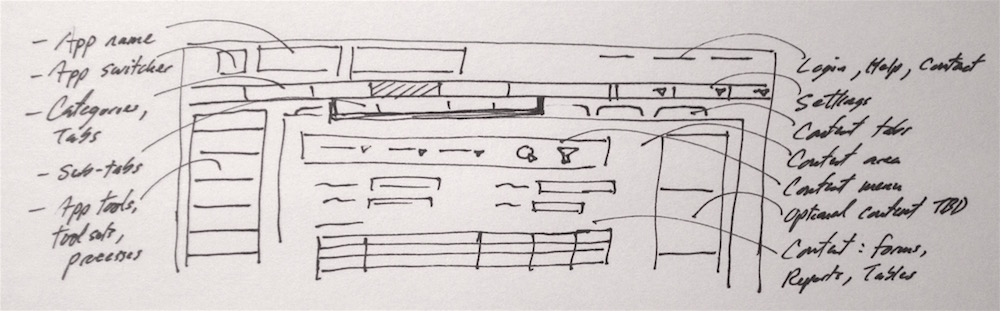
A high-fidelity mock-up for visual explorations for a common navigation mechanism.
Prototype and Test
Example guidelines pages were prepared, with real content in place, to get a basic HTML internal site up for review and walk-thru.
- Provide simple heuristic eval forms
- Arrange tests to take up very little of dev's time, and for unsupervised testing
- Hold review-meetings to collect additional comments
- Refine, and hold a 2nd round of tests, then go live, with ongoing refinements.
Simple interactive wireframe prototypes were used to help finalize common sequences and behaviors.
Final results
The guidelines site was up and running for full in-house access.
As comments came in, changes were reviewed and integrated.
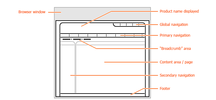
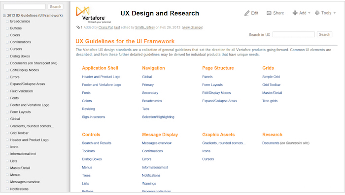
Example from the style-neutral guideline for base navigation and general page structure.
The project was largely successful, but also very much a learning experience, some key points:
- Surprises from marketing/branding, as they announce their own design guidelines that overlap and contradict part of ours...
- Senior designers that design their own unique variations rather than align toward the guidelines.
- Dev sometimes ran with the visual part of the guideline, but not always with the details.
Sitting with developers for one-to-one discussion about a guideline was still needed.
- Management may perceive that once guidelines are in place, UX is done.
- Some designers don't do HTML, so their additions/edits to the guidelines often needed fixes.
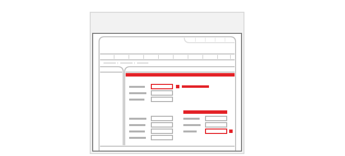
Example from the style-neutral guide for common error indication locations.
Next project →