User Experience and Product Designer
Image shopping on any device
From desktop to smartwatch
The project proposal was for a quick and easy way for users to search through a catalog of stock photos or imagery—on any device. (This was part of a UC San Diego certificate program.)
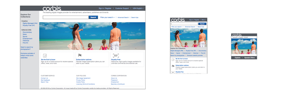
High-fidelity prototype screens for laptop, phone and smartwatch.
The initial goal was for an app scaled for only the relevant tasks on each device type:
And for a seamless experience across devices.
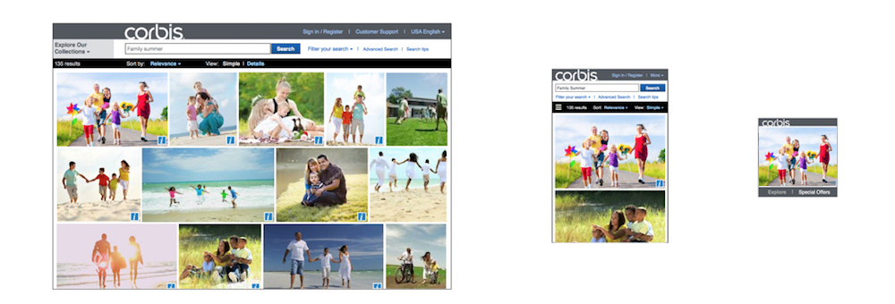
Search results displaying on each device.
Role, Scope, Schedule
The designer's role: A one-person team for research, design, prototype and test.
Product planning and strategic considerations focused on dev cost and an aggressive schedule, with focus on the minimum viable product (MVP) for each device.
Requirements and constraints
First investigate what's known for each device category, such as image resolution and
Research and investigation
Quick proto-personas were prepared. Discussions with stakeholders were held to collect their assumptions about the customer/user.
Card sorting was used for determining user wants/needs, and for dev's easy/hard coding concerns, for prioritizing.
Competitor review for similar products on each device type were prepared, UX standards emerging for smartwatch were reviewed. And a survey helped collect user expectations for each device type.
Findings indicated a user that's often very busy, multi-tasking with email, phone calls interruptions, etc.
Ideation, design phase
Low-fidelity prototypes were used to test suggestions. Heuristic evaluations of tasks were conducted on paper prototypes. And slideshows of sketches were used to storyboard and preview experiences.
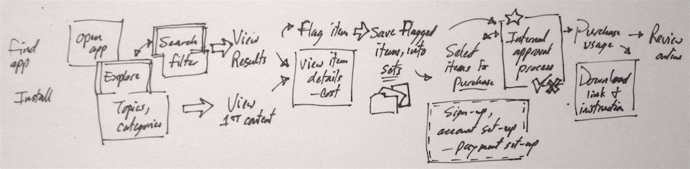
Whiteboard main task flow detail, indicating Search, explore
Design decisions
Use big easy-see-and-touch buttons rather than swipe gestures the user would need to learn and remember. And keep controls and UI visibly distinct from, and not as "strong" as, the imagery.
...the picture is more important than the picture frame.
Let the user easily back out and return to where they were. And keep a history, let them find images they discarded, but also allow them to "clean up" their history.
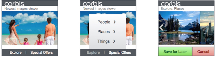
Sketches for the steps to an individual item details, saving into sets, and approval before purchase.
The provided images would be treated like part of the design, as this is how users will first see the app. The initial release would include a free collection of safe general images. These would be part of the "explore phase" when the user first tries out the product.
Additional details for UI and visual design:
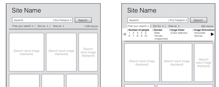
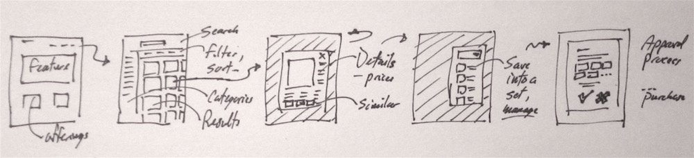
Wireframe for search and filtering on a tablet.
Designs were reviewed with dev for comparison to what their UI toolkit can easily do.
Don't ask developers to re-invent a wheel...
Strive for a
Prototypes and stand-up tests
Paper prototype screens and parts of screens were held over real mobile devices, by users who also stood or walked, in scenarios based on research. These stand-up and walking tests were an effort to allow the ergonomics of handling mobile hardware to factor in.
High-fidelity mock-up screens for smartwatch were used as a more realistic predictor of how menus could display.
Test results and refinement
Refined prototypes included some higher fidelity screen mock-ups to test visual design details. Slideshow click-throughs were used to test visual design element behaviors.
Many initial suspicions were confirmed. Users also wanted an easy way to bail out and start over, and ability to pause and resume where they left off.
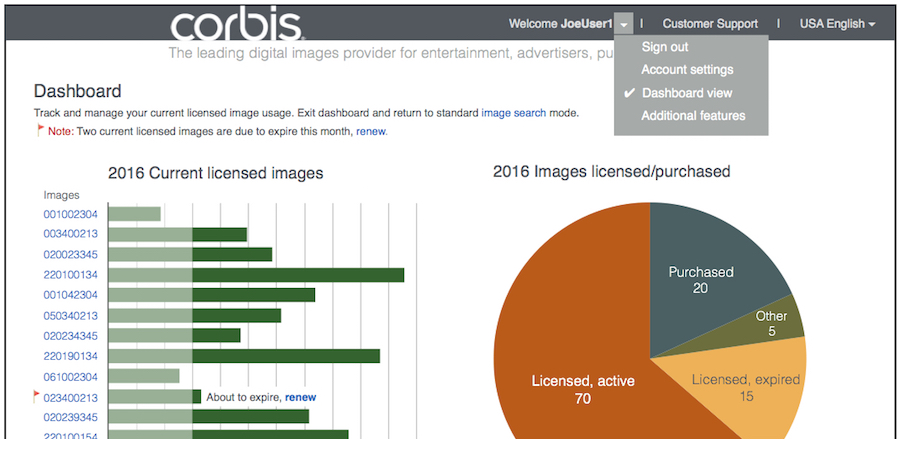
A dashboard to manage purchases and license renewals was also part of the product, viewed through the desktop/laptop and phone, but not on the smartwatch.
Final results, lessons learned
Content is king, especially in this case.
The trick in testing was to get users deeply into their task, focused on the imagery, not the UI, as they would be in their