Richard Emberton UX Design
User Experience and Product Designer
Coding-for-Kids classes
Helping parents make a decision about their child's education
TechSmart Kids asked me to help design their process to inform and invite parents to
enroll their children in a new "learn to code" educational program.
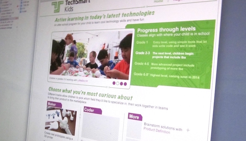
High-fidelity prototype utilizing existing branding.
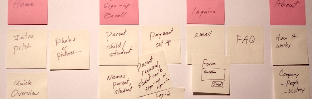
We needed to first determine what the site would include:
- Content to entice parents to contact a representative, or sign-up directly.
- Content that works for the parents and their children (the potential future students).
- Balancing informative content with sales pitch...
- And the sign-up or request-more-info processes.
Card sorting for priorities and minimum viable product features.
Role, scope, schedule...
The designer's role: A one-person team for research, design, prototype and test...
This was a fast-moving project with a tight budget.
With minimal resources for research, recommendations and advisement based on general best practices would be provided.
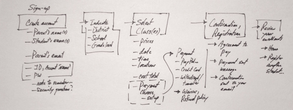
Task flow sketch for navigation, order and content.
Requirements and constraints
A key requirement was to display only the necessary information and no more, for the customer to make a decision to go forward.
Development and maintenance were also factors, so we'd need to keep it technically simple, but still look professional.
Research
Quick proto-personas were created (prototypes of personas base on what we know at the time.)
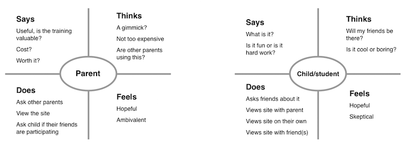
Empathy maps for both parent-customer and child-student.
Methods also included: Stakeholder interview, competitive analysis and contextual inquiry.
Customer experience vs. user experience...
Quick journey maps were prepared to address both roles and how they overlap:
- Parents were the customers, for making the final purchase decision.
- The future students (the children) were co-customers with their parents,
in that they could influence whether or not the parents moved forward to inquire or sign-up.
- Both where users of the promotional and introductory content, so it to speak at a level appropriate for both.
- Central content areas and attention-getters, vs. more "serious" top and corner navigation...
Ideation, design phase
Quick storyboards were used to capture the over-all process and key tasks:
- The parent or child observes an initial brochure or sign at their school, or a browser ad.
- They're directed to the website, directly or through an intermittent social media site.
- They view a landing page, above the fold...
For parents: "How will this help my child? How much does it cost?"
For kids: "Is if fun? Will my friends be there?"
- Initial "hooks" and available drill-downs to More.
- All the while making the contact/inquire and sign-up visible for the parents.
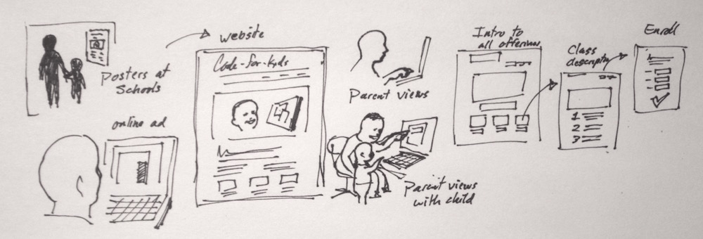
A "happy path" sketch, from viewing an ad to viewing the site, and inquiring more info.
Design decisions
Focus was mostly on information architecture, how much to show, when and where.
And the balance of visual imagery with textual content...
The customer and the user may not be the same person.
The design for the sake of ease of development would be kept straightforward, using existing plug-in mechanisms for contact and sign-up.
Additional details:
- Could we use actual photos of classrooms and students, or representational illustrations...
- Addressing customer/user's immediate questions, and attention spans...
- Responsive design: How will it all re-arrange and present effectively on all likely devices...
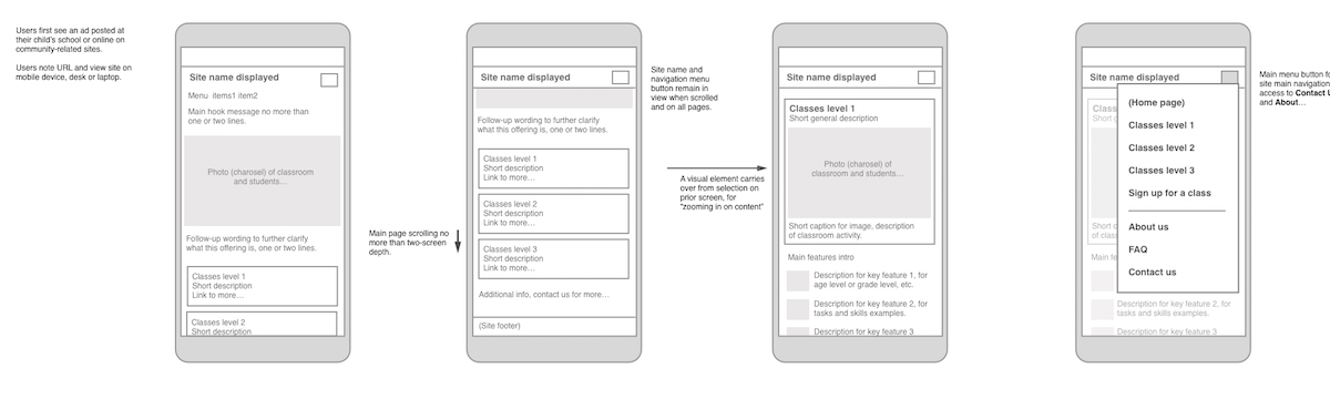
Wireframe for how the initial content would display on a phone.
Prototype and test
Cognitive walkthrough exercises with lo-fi and hi-fi prototype screens helped de-bug the flow.
The proto-personas were reviewed, then recruited test subjects "role played" through prototypes.
Test results and refinement
Steps were reduced to get key info in front of there eyes more immediately.
With each step there's opportunity to bail out.
(Interestingly, parents often bail-out before kids.)
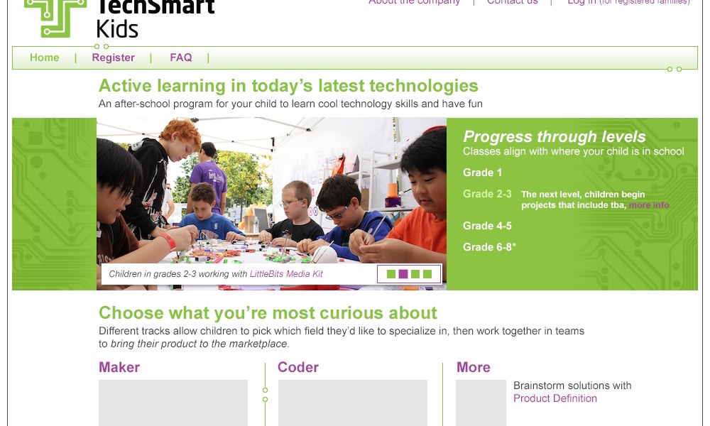
High-fidelity mock-up screen for hand-off to dev.
Final results, take-aways
A successful product shipped. Customers began calling.
Surprises and learnings:
- Scrolling vs. page-turning vs. More links...
Some users ignore content below the fold, and some scroll immediately.
Some users act on a "More" link as soon as it is visible.
And some users are hesitant to enter a page-turning sequence (a feeling of obligation...)
- One set of content that works for very different age groups isn't too difficult.
- Our stereotypes about attention span are wrong.
- And if it looks like "fun" that's a big decision factor.
Next project →